Introduction
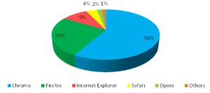
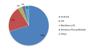
As the Probably Market Scenario and the world most popular search engine that your small business sites should be responsive to rank on Google . The current Mobile Market share 83% is owned by Google stated in 2012 . The Algorithms Prefer Responsive design and the most recent Google algorithm update reinforces the search engine giant’s dedication to mobile-friendly pages.
Responsive web design (RWD) is becoming the preferred method for developing websites that look and work consistently on all devices . The idea behind this strategy is to give all users a seamless digital experience no matter what device, browser, screen size or orientation (portrait vs. landscape) they use. It also means ensuring that the functionality, performance and visual layout of websites are consistent across all digital platforms and various user conditions.
At first, this may seem like a no brainer, but when you factor in the importance of user experience (UX), the continuous testing of new features, and guaranteeing your website is working optimally on all browsers, devices, OSes and carrier networks, RWD is actually daunting and time consuming. Understanding how a responsive website actually behaves and looks across all digital platforms is a great challenge for many app development and QA teams.
What’s Driving the Shift to RWD?
The answer is simple. In today’s world, there’s no longer a difference between website usability and the platform used to consume data and services. According to Criteo’s State of Mobile Commerce report, 4 out of 10 transactions today take place on multiple devices . In that context, 48% of users today complain that the websites they use are not optimized for their smartphones and tablets. By that measure, delivering a great user experience across all digital platforms is a critical to driving more traffic and meeting business goals. Organizations that wish to be ready for new device and operating system releases should select RWD as their app development method because responsive sites are, by definition, designed to work on any device and platform.
Another reason for the shift to RWD is that it helps assure quality and fast website updates across all digital platforms. Because mobile and web evolved in parallel, many organizations created silo’d teams with different skill sets. They often relied on the same tools but disconnected roadmaps and different release schedules. This disconnect prevents web and mobile
DevTest teams from having control over the entire digital portfolio. When developing for different platforms, it’s hard to assess the quality of every digital viewport and function across web and mobile because different teams are executing different test cases instead of running tests side by side. The RWD approach is seen as the most efficient because it consolidates efforts, synchronizes the digital teams and reduces the R&D budget.
RWD Test Plan Building Blocks
Here are the top five areas that need to be covered in an RWD test plan.
| Test Scenario | Test Description |
| Visual testing | Assure RWD content looks right on any screen and platform. |
| Client side performance testing | Test and measure the time it takes your website’s objects to render on screens and optimize the content size accordingly. |
| Navigation testing | Assure that the site performs the expected function correctly (i.e. Log-in functions well across web and mobile platforms). |
| User condition testing | Test your site across platforms for real user conditions such as incoming calls, ads, popups and other interruptions |
| Platform coverage | Use analytics to test your website against all relevant devices, browsers and OS versions
|
Create Actionable Test Reports for RWD
One of the biggest struggles for RWD dev and test teams is identifying specific bugs. Even when they do identify the bugs, reproducing them is a huge challenge. For DevTest teams to efficiently develop, test and run through the continuous SDLC, they must have a deep, actionable, side-byside synchronized report for all digital platforms that shows which browser/ OS combination was affected by the bug. We’ve touched upon the importance of UI and visual validation as part of RWD test automation, but including validations of failure in reports makes a big difference in the time it takes to resolve bugs.
What should a RWD test report include?
- A side-by-side synchronized view of test results across all the platforms you are testing your website against
- The ability to filter only the failed combinations
- Actionable information from the failed test with
- Screenshots
- Platform debug logs
- Network logs
- Video


